ILFORD ORTHO PLUS
Ilford Ortho plus was released in October 2019, and as of the beginning of 2020, I hadn't yet had a chance to shoot it. However, having seen some interesting landscape images taken with it, along with it being a fine grain film with excellent sharpness., I was intrigued to see whether it would be a film that would find it's way into my camera bag.
From the Ilford Website;
“ILFORD ORTHO PLUS is an orthochromatic black and white film. Designed as a high-resolution copy film for negatives, ORTHO PLUS offers superb photographic potential thanks to its fine grain and sharpness.
Ideally suited for landscape photography, the blue and green sensitivity of this emulsion enables the film to be handled in deep red* safelight conditions making processing and inspection easier.
Its lack of red sensitivity also means that reds and oranges in your frame are rendered darker with stronger contrast than standard panchromatic films (all other ILFORD and Kentmere films are panchromatic).”
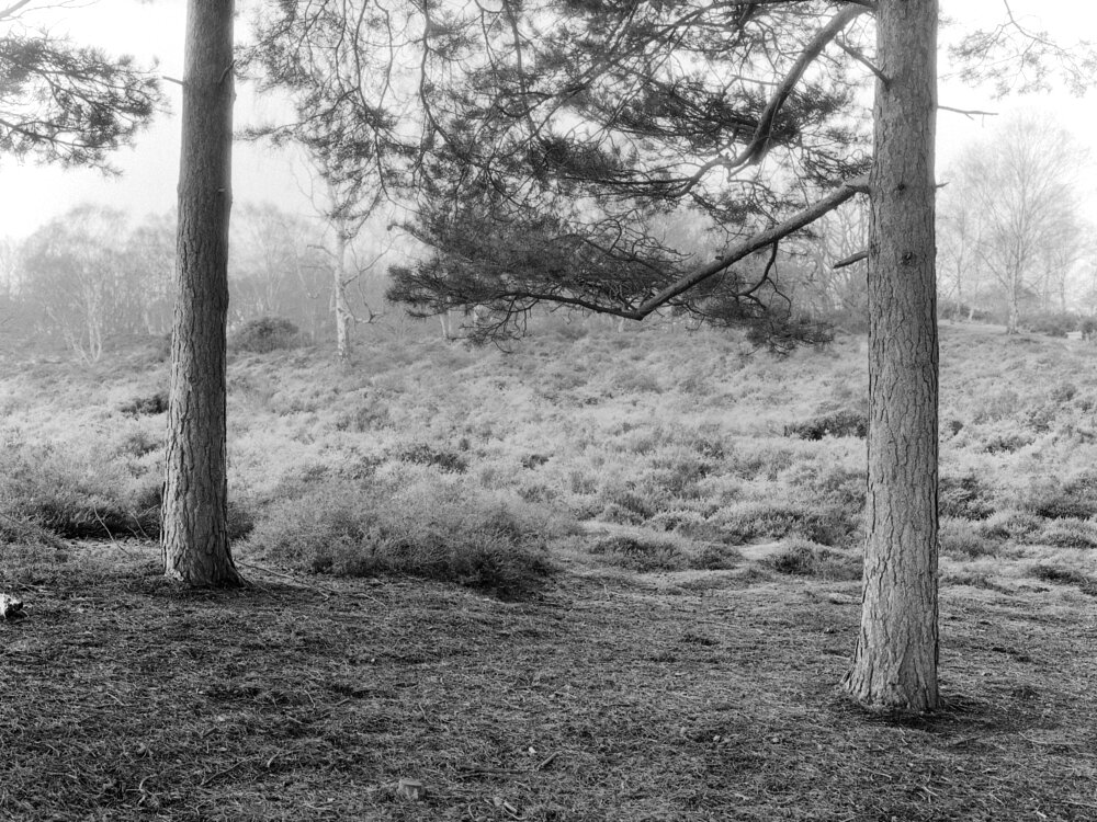
Landscapes
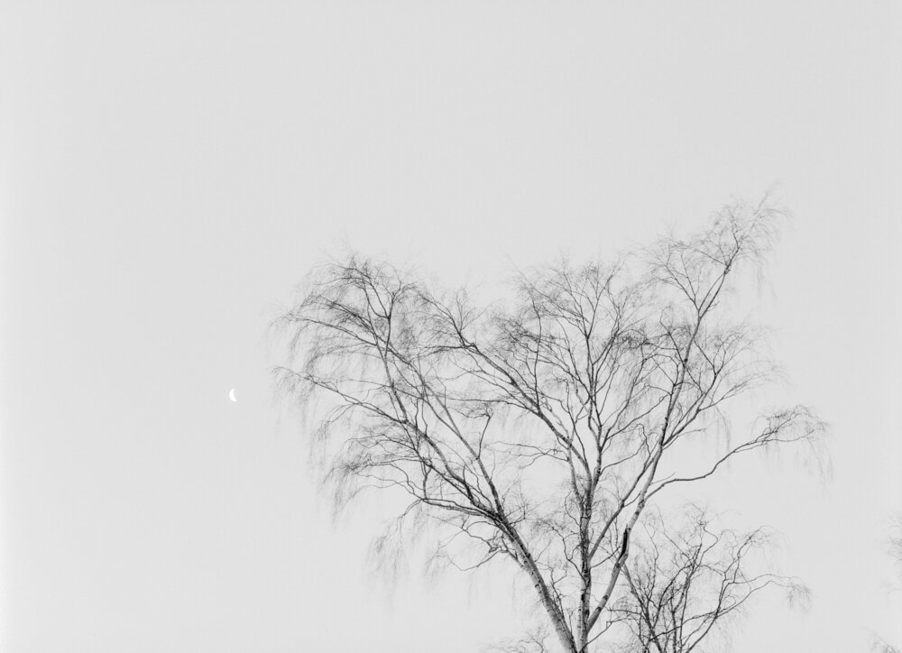
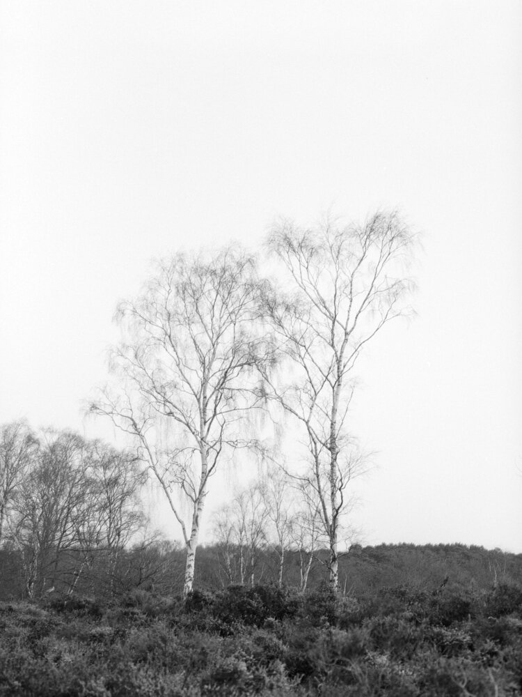
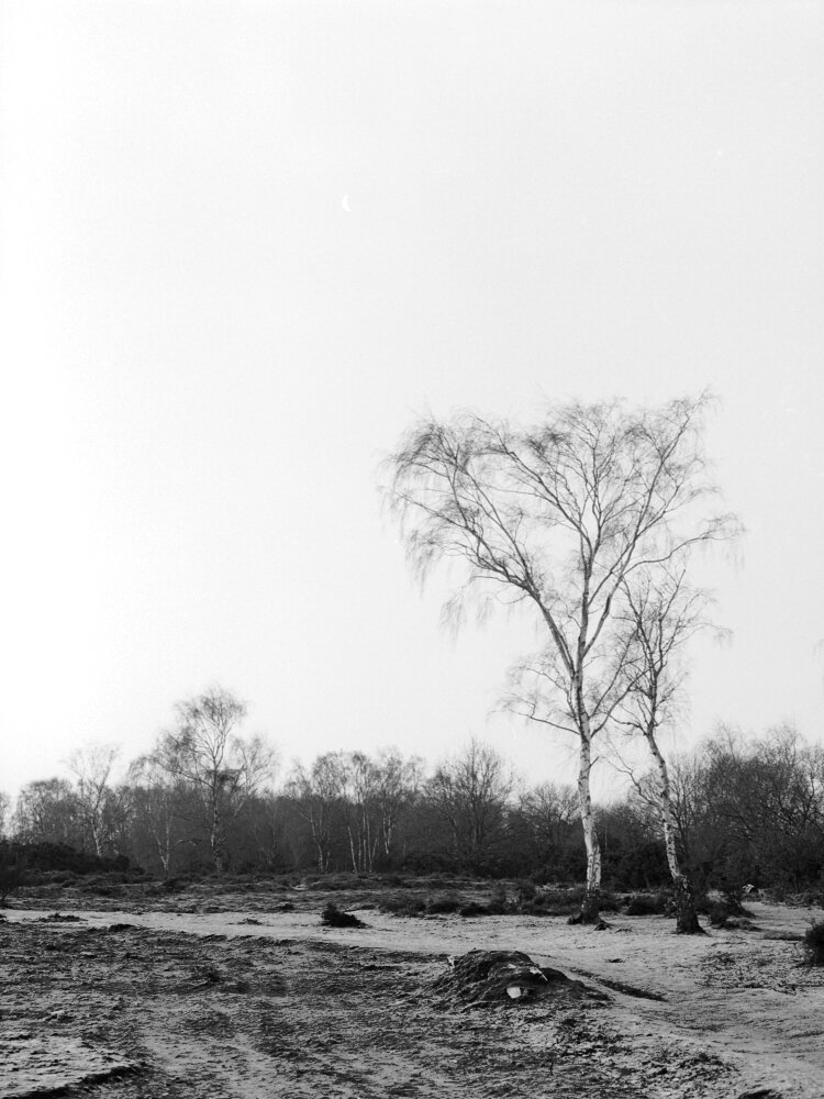
I decided to start with what would be the most common area I expected to be using it; in the landscape. It was a frosty morning with a clear blue sky, and the difference between an Orthochromatic and a Panchromatic film became immediately clear. I would have normally expected the sky to be darker with more tonality on display, but it's a lot lighter with less tonality gradation.
I was impressed with the sharpness of the film. It has a good level of contrast, but nothing too strong that might make printing in the darkroom a bit more of a challenge.
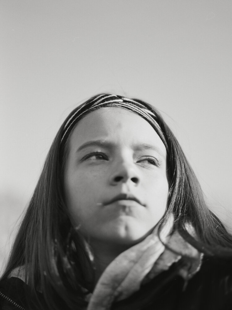
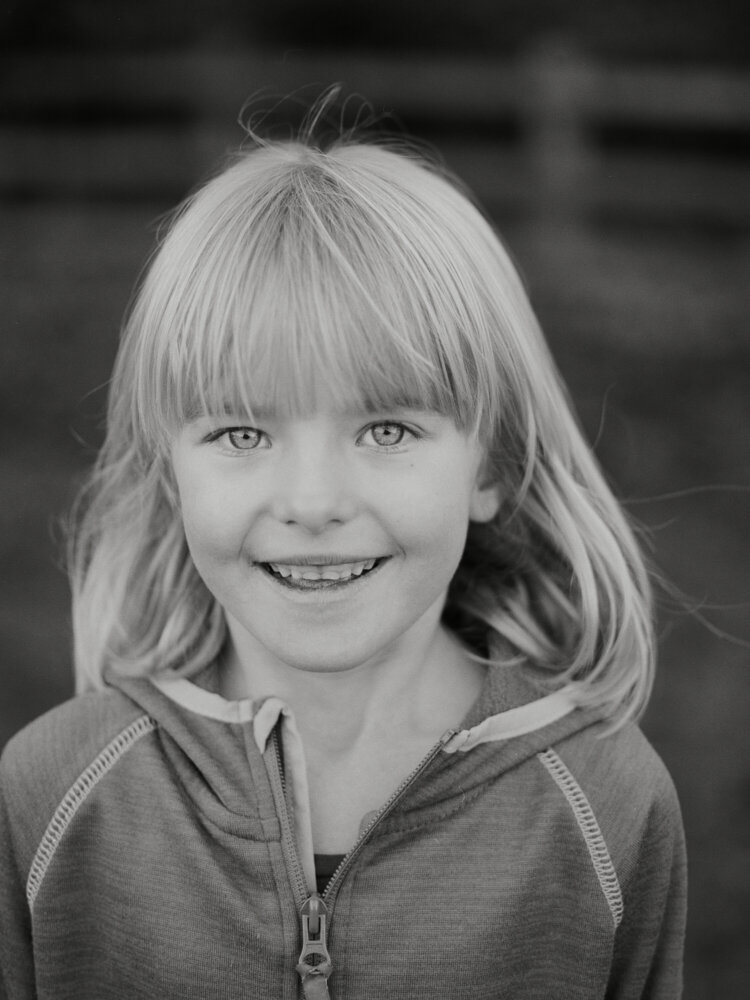
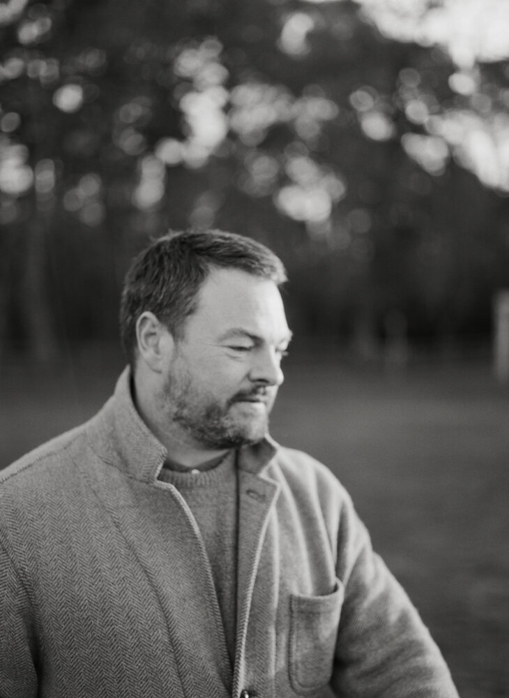
Portraits
Seeing as Orthochromatic film is not sensitive to light beyond yellow, it shouldn't be a film naturally suited to portraits because it's essentially not sensitive to skin tones. That doesn't sound like it should be good portraits, but I wanted to see how it would handle it.
The following portraits were all shot on a bright sunny day with strong light. I like how it's rendered under these conditions. The images feel 'older' than they are. It's hard to describe, but it doesn't have a modern-day aesthetic which I like. Again, the images are aimed at demonstrating the film, not my portrait skills.


Summary
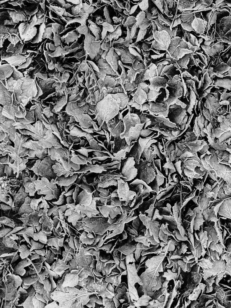
I've only shot 2 rolls so far, and I'll continue to shoot it for a while. It won't be an everyday film (that's either HP5 or Tri-X for me) but it will be useful to have in the bag as an alternative, especially when shooting in the landscape where I want to achieve a specific look and feel. The landscapes feel bleak which will suit some scenes more than others, but it may also make a good option for close up work due to the fine grain structure and detail.
As I shoot more rolls under a wider set of conditions, I'll update the blog.


A series of images from a Chateau in France using a Hasselblad X-Pan with Ilford Photo HP5 film